About Course
Tableau is a powerful data visualization tool that allows users to create interactive and shareable dashboards. Here’s a step-by-step guide on how to perform data visualization with Tableau:
1. Connect to Data:
- Open Tableau Desktop.
- Connect to your data source, which can be a spreadsheet, database, cloud service, or other data repositories.
2. Explore Your Data:
- After connecting to your data, Tableau displays a data source tab. Explore your data to understand its structure, columns, and values.
3. Drag and Drop:
- Use Tableau’s drag-and-drop interface to build visualizations.
- Drag fields from your data source onto the Rows and Columns shelves to start creating charts.
4. Create Basic Visualizations:
- Choose the type of visualization you want to create (e.g., bar chart, line chart, scatter plot).
- Customize the visualization by dragging additional fields to the Marks card, adjusting colors, sizes, and labels.
5. Use Filters:
- Apply filters to focus on specific subsets of your data.
- Drag fields to the Filters shelf or use the filter options in the side panel.
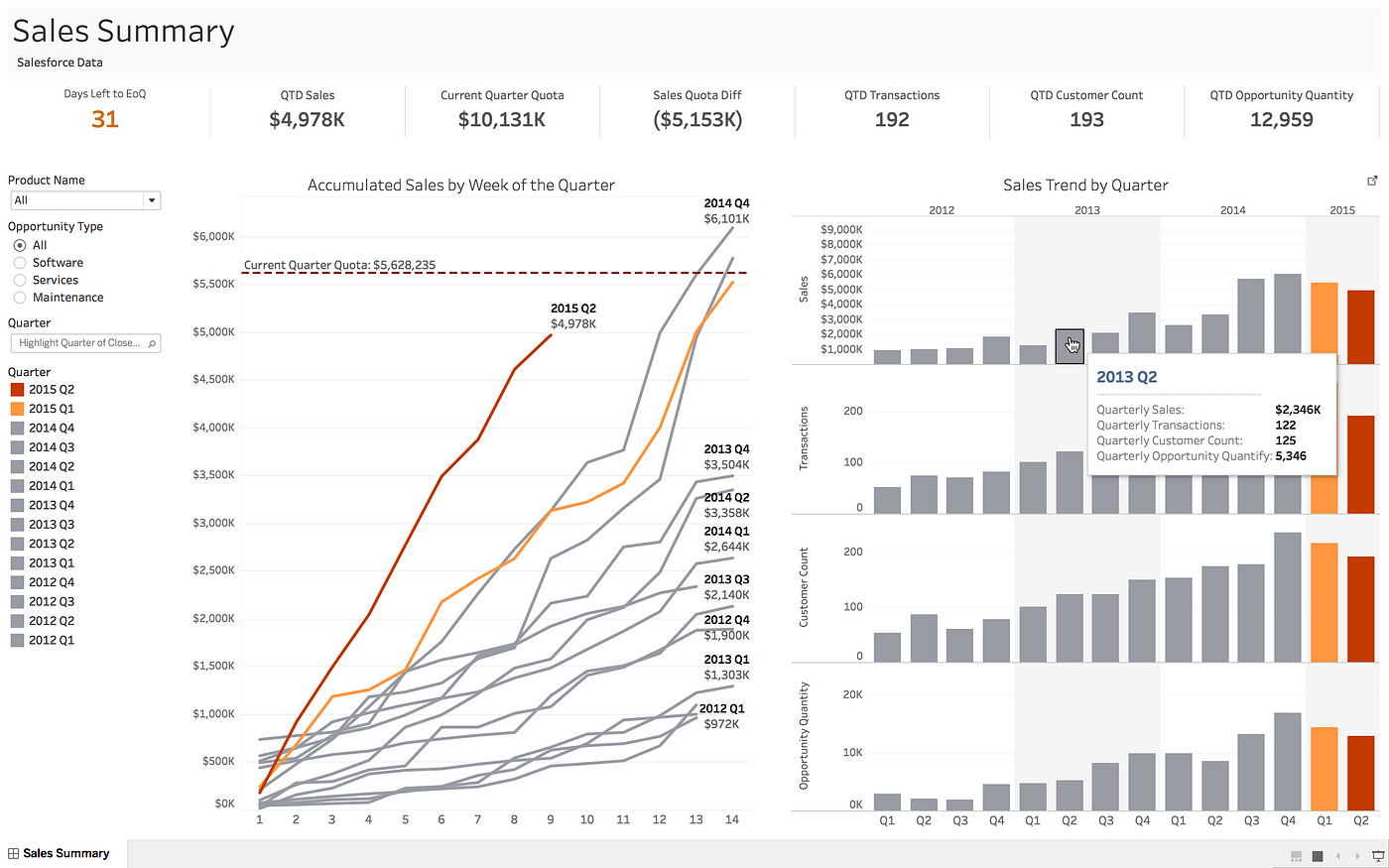
6. Create Dashboards:
- Combine multiple visualizations into a dashboard.
- Click on the “New Dashboard” tab and drag your sheets onto the dashboard canvas.
7. Add Interactivity:
- Make your dashboard interactive by adding filters, parameters, and actions.
- Create drop-down menus or filter actions to allow users to explore the data dynamically.
8. Use Calculations and Parameters:
- Create calculated fields to perform custom calculations on your data.
- Use parameters to allow users to switch between different measures or dimensions.
9. Add Trend Lines and Reference Lines:
- Enhance your visualizations by adding trend lines or reference lines.
- Customize these lines to highlight specific insights or benchmarks.
10. Format Your Visualizations:
Student Ratings & Reviews

No Review Yet


